|
my inspiration to do a camp site was the theme nature,and camping is a rewlly good example of that becasue you are sleeping in the woods or forest. A big difficulty that i had during this process was getting the pain to not have any patches where the color didnnot show. the wat i over came this was by re printings the pain on the same layer. In the future i would put more paint on and press down harder so the pain actually sticks. If i was to redo this project i would make sure every later was perfect and neat. 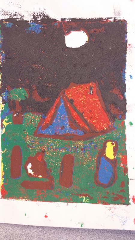
0 Comments
i thought that this project and the process was really fun. it was also really great because it can be what ever you want and not very strict and if you mess up you can always make it look like you wanted it like that. Its good because they might have really good ideas that you never thought of. our thought process during this piece was to make all the colors blend and not be too crazy. also we thought about the patterns we where using. we didnt really have a theme it was more of a simple brown colored paterns of many different things but not based on one thing.  The most helpful paint warm up to me was when we sketch the cloth that was hanging up from the ceiling because it shows you how to make different colors for different areas that don't get the same amount of light. I was born in new york and then moved down to north carolina when I was eight years old and began skating when i moved here. So I decided to bring in one of my old boards and put a line diagnal from each tail; of the board. and chose one side to be the new york sate flag and the other to be the north carolina flag. i found it difficult to get the yellow to show up with out it showing the base color. also i found it diffcult to pain the new york flag. i would have changed my base color from blue to white because the yellow would have came out alittle better. i found that the nc state flag came out good and was probably the miost succsesful part of the project. also the two women on the New York state slag came out pretty good.  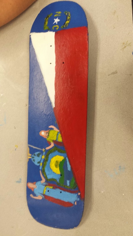 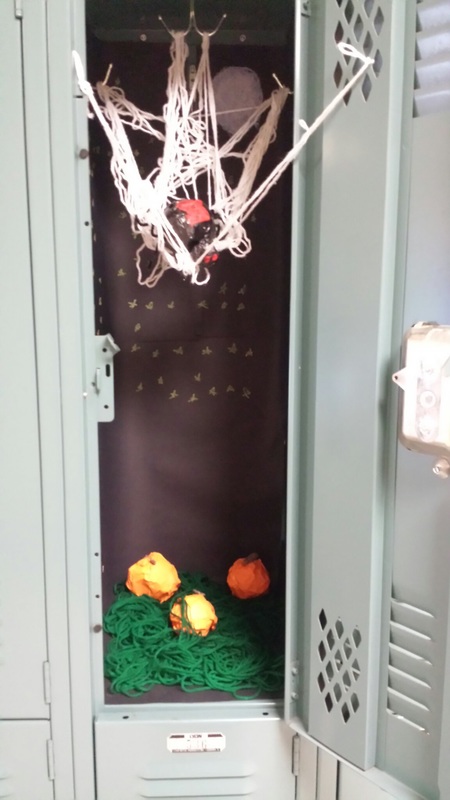 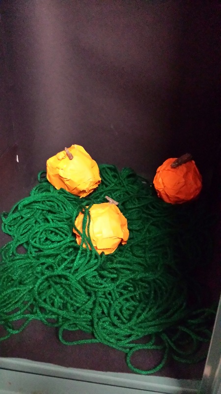 the theme of our locker was holloween. We were inspired to do a holloween theme because it's coming up soon and it's also fall.The thing that was difficult about working in such a small area was having to make everything the right size to fit and getting everyone to work on it at the same time.Some materials that we used were oil pastel on construction paper, tape, pipe cleaners, real sticks, spray paint, and yarn.
My mentors name is Ambika.
we talked about our favorite mediums,favorite projects, and how they got in to art. most interesting thing about my mentor is that if she can go anywhere in the world she would go to Disney world. BLOG LINK: ambika-apex-2016.weebly.com The way my piece is similar to the inspired peice is that they are both drawn with ink. Also they both have the same pose.My process of drawing this piece was starting with an outline made with pencils.Then I traced over it with a Sharpie and then colored it with colored shapries.I also added some cross hatching in the piece. yes I found this project relaxing.I also think that zen matches this style. Just like my other ink pieces I started this one with an outline with pencil. After that I traced the outline of the shark with a sharpie.Once I got the outline of the shark done I started the patterns. The way I put the patterns on the shark was starting on the bottom fins and going all the way up the shark making a new row for a certain pattern. yes it is very hard to draw an eye using ink.The reason why it's hard to draw eyes using ink is because the mistakes stand out more.Also you can't erase ink like you can pencils. The way I put the eye in pice was by making the main idea a big eye. 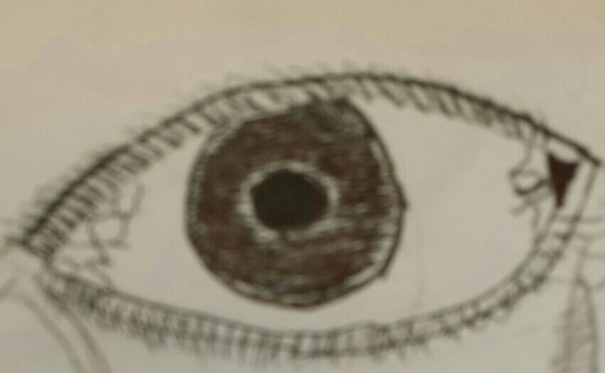 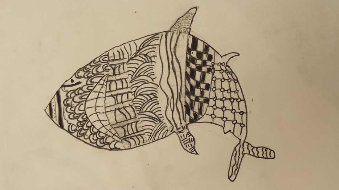  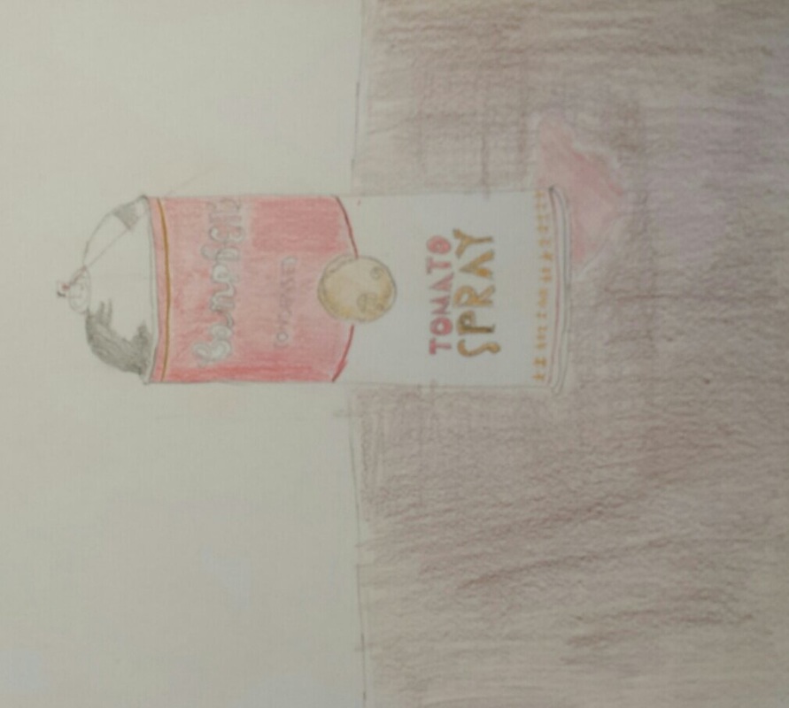 Link at bottom
the piece I drew was a a can of Campbell's tomato spary. My medium that I chose was color pencils. the thing that makes my priced similar to my inspired piece is that it's a drawing of the can and the colors. Although that they are dimmer they are also really different. My can is leaking out of the bottom. on to a table which is not in the inspired drawing.the most successful part of my drawing is the shadows on the top of the spray can and the leaking on to the table. in a future price I would Change the view and I would make it zoomed out so you see the whole table and I would add extra items so it would give the piece more qualities and look realistic. INSPIRATION LINK:https://www.pinterest.com/pin/22306960627294888/ the first picture is illustration Friday for prize. there were some difficulties but in the end I fixed and over came those difficulties. the first difficulties was getting all the "stuffed animals to be a good size not to big but not to small. Another problem was to get the ticket to cover the teddy bears leg. the way I over came this was but first, drawing the ticket and then drawing the teddy bear but instead of drawing 2 legs I drew 1. for my second picture I chose to use my hand drawing. The process I used to draw this was looking at my hand and drawing it on to the paper, and estimating the proportions of my hand and scaling it to size for the paper.The first difficulty that I came across was getting the fingers to be proportional with each other. The way I over came this difficulty was buy drawing a line across the fingers and estimating the size difference. the second difficulty I came across was getting it to look realistic.I found out that drawing lines on the creases and the lines from your own hand give it a great feature and helps it look realsistic. 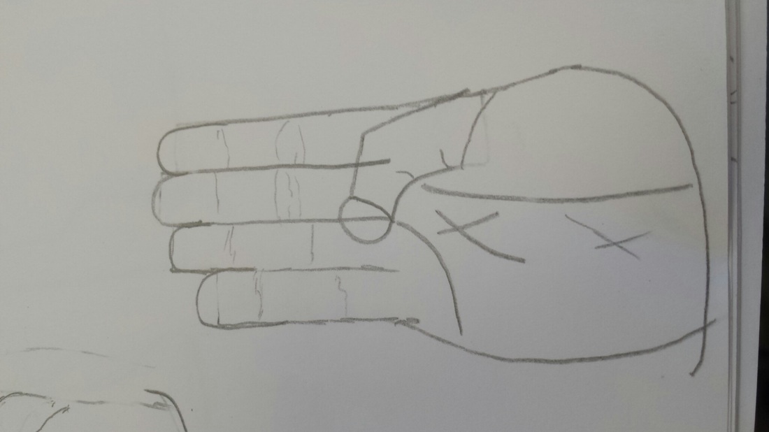 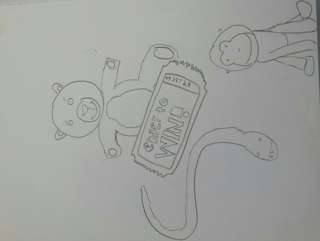 My art movement was impressionism. This movement took place during the 19th century that was out popular in France.A very famous artist from this movement is Vincent Van go he created the starry night.The idea of impressionism is not to show every detail but to have quick brush strokes which is shown as well in the starry night. I chose to draw Donald Duck and a background that was many colors blended together and made to look like it doesn't have to much detail and quick brushstrokes. I was inspired by all the cool backgrounds in the pictures created by famous artists and chose some colors and try to recreate it in my own way. 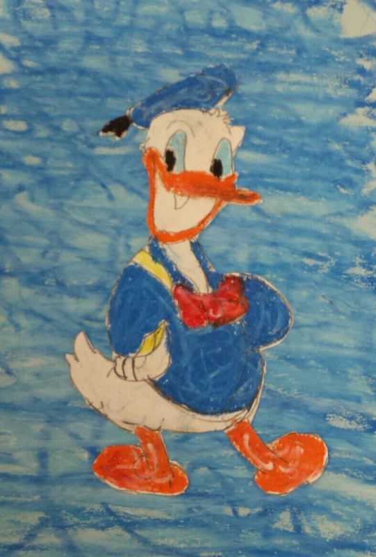 |
AuthorWrite something about yourself. No need to be fancy, just an overview. Archives
March 2017
Categories |
 RSS Feed
